Side-by-Side Sections
Side-by-Side Sections display questions and answers in a condensed, two-column layout. This can make it easier and faster for field users to scan, complete, and confirm the answers in a form. This topic describes how a Side-by-Side Section works and when to use it in your form.
Available on the Intelligent and Elite tiers:
Contents
How Side-by-Side Sections work
Side-by-Side sections display questions in a two-column layout in the TrueContext Mobile App. With Side-by-Side Sections, you can:
- Remove extra space in the form to reduce scrolling time.
- Fit more information on a single screen, which makes it easier for field users to scan for context within and across sections.
- Vary section formats to make a form easier to navigate.
Note:Customer Feedback forms do not support Side-by-Side sections.
Side-by-Side Sections in the Mobile App
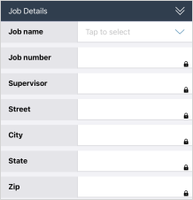
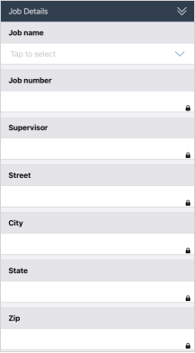
The following example shows a comparison of a Side-by-Side and a Regular Section A Regular Section is a set of related questions grouped together for easy reference. The data captured is “non-repeating”. That is, field users enter a single instance of each answer. in the Mobile App. The first example shows a Side-by-Side Section. The second example shows the same questions in a Regular Section. The two-column layout makes the Side-by-Side section shorter than the Regular Section.
Two-column Side-by-Side layout
Over-under Regular layout
Side-by-Side Sections in the Form Builder
When you create a Side-by-Side Section, you choose a question-to-answer ratio.
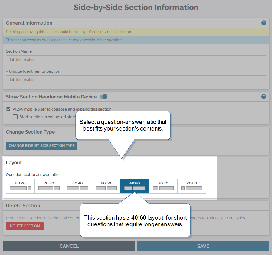
The ratio determines the width of question text and answer field columns in the TrueContext Mobile App. By default, the ratio is 50:50, which works well for most questions. Some question types always display at full width. You can also Keep question width to 100% for specific questions within the Side-by-Side section.
Side-by-Side section settings only apply to form pages in the Mobile App. They have no effect on the summary view, document formats, or Web Portal display.
-
When you select a question-answer ratio, think about the question types you plan to include in the section. Wider question types, like Button Group, don’t fit well in smaller answer widths, especially on smaller devices.
-
The Side-by-Side display works with views wider than 390 dp. Smaller view screens display the questions full width.
-
Use the Change Section Type setting to easily switch between Regular and Side-by-Side sections. You don’t have to re-create existing sections. Edit the section to change its type.
Side-by-Side Section setup
To add a Side-by-Side Section, fill in the section information, choose a question-to-answer ratio, and save your changes.
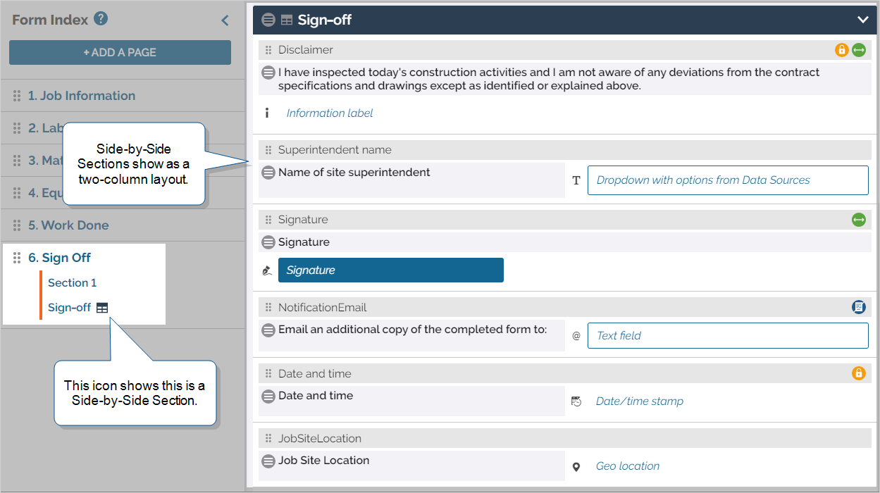
The Form Index displays the Side-by-Side icon  next to the Side-by-Side section name. When you add questions to the section, the Form Builder shows the questions in a two-column layout.
Info:The topic Build Sections describes in detail how to add and set up a Side-by-Side section.
When to use a Side-by-Side Section
The following table describes each section type and layout.
| Section type | Layout | Example | Works best for… |
|---|---|---|---|
| Regular | Full-width, over-under (“stacked”) | 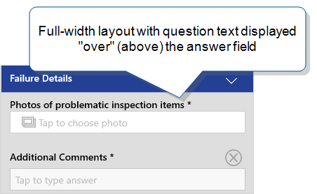
|
|
| Flexible, questions flow from one column to the next | 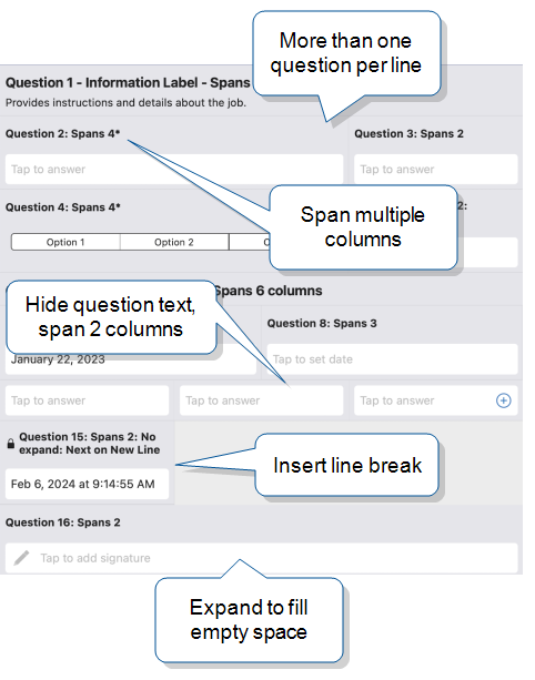
|
|
|
| Two-column, with configurable ratio | 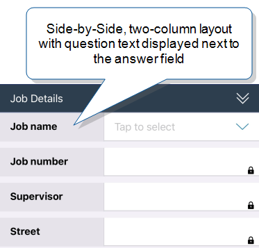
|
|
|
| Full-width, over-under (same as a Regular Section) | 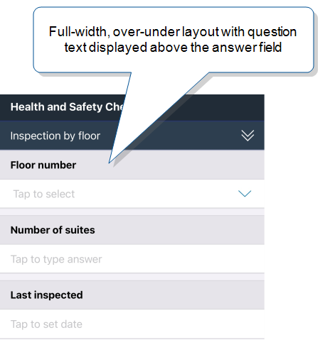
|
|
|
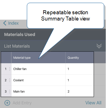
| Repeatable |
Summary Table for quick reference and editing |
Note:Use a Repeatable Section |
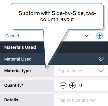
|
| Summary Table Advanced options |
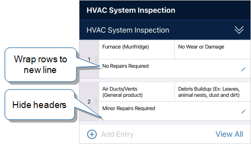
This example shows rows wrapped and headers hidden:
The Full view
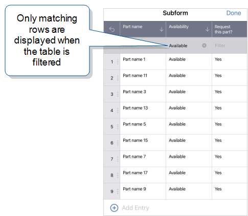
This example shows the filter option:
|
||
| When the subform opens, the layout can be over-under, |
|
Info:The topic Form Layout Options provides more details about the different layouts.
Full-width question types
To ensure the best user experience, the following question types always display at full width in all sections, including Side-by-Side:
-
Audio Recording
-
Card List
-
Document Editor
-
File Upload
-
Image
-
Information Label
-
Resource Image
-
Signature
-
Sketch Pad